
In our last lesson, we learned some basic commands to fetch data and export it into .csv files that we could work with in a spreadsheet program like Excel or Google Sheets. Now that we’ve got all those beautiful columns and rows, what, exactly, do we do with it? We’ll start by exploring sports betting data correlation and see if we can discover statistics we can start to use to shape a bottom-up betting model.
Broadly, the first thing you need to figure out is what question it is that you’re trying to answer. That’s going to inform everything from data selection to the techniques you use to analyze it.
The little adventure we’re going to take together will examine a stat in use on Baseball Savant, “hard-hit rate.” Statcast, which powers Savant, defines a hard-hit ball as one with an exit velocity above 95 mph. For every tick over 95, there’s a corresponding and significant jump in a player’s weighted on-base average. We’re going to see how well this stat correlates to full and partial game Overs.
To start, we’re going to need to acquire some betting data. For some sports, this can be simple using some of the R packages we mentioned in our last installment. For others , it can require more hunting.
To make things simple, we’re going to make some data available you can work with, but if you want to learn the how-and-where, skip ahead to the Extra Credit section. You’ll be able to use the code we provide to generate the same file.
This worksheet contains batter data from 2021. It’s important to note that this data isn’t going to be a sufficient basis for building a model in and of itself. We’re just showing you how to begin sourcing and thinking about data.
To build a model, for example, while you could exclusively use data after a certain point in the season, you may want to start out with priors. It’s a bit beyond the scope of what we’re doing here, but it can be an important step in the modeling process.
Before we start testing out our hypothesis, take a few minutes to play around with the data we do have.
A powerful means of exploring data is using pivot tables in Excel. Here’s a video that explains the basics of pivot tables. They allow you to sort, aggregate and process data in a more manageable (and visual) way.
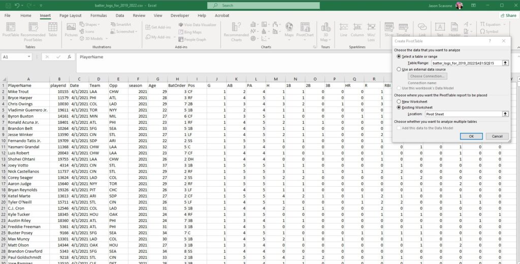
Choose “insert” and “pivot table” at the upper left. Excel prompts you to select which data you want to build your table with. Selecting base hits for Mike Trout through Nick Castellanos builds this table:
The fields on the right will add or subtract values to include in the table. In the “Values” dropdown you can change how the columns operate, choosing among sum, average and more.
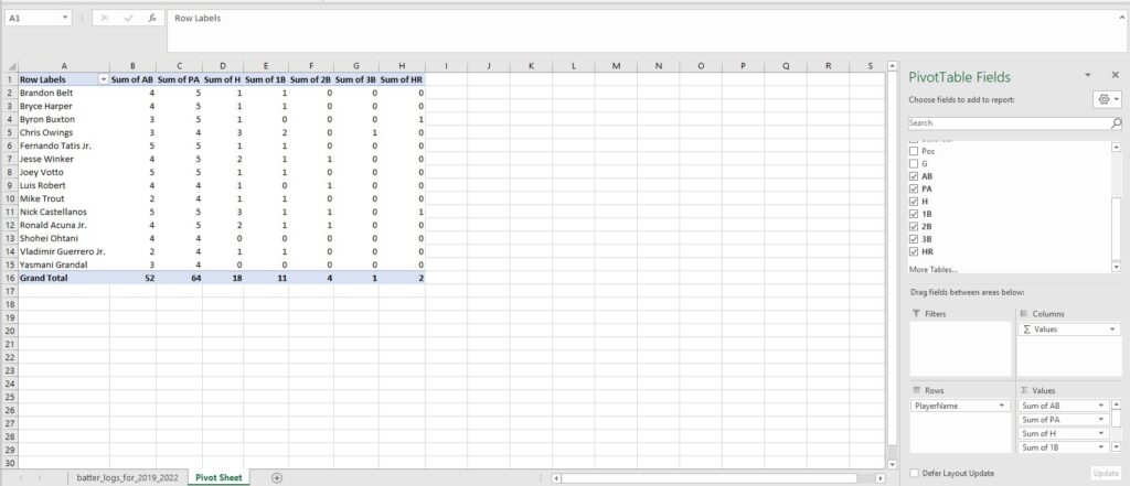
It’s a useful way to start examining your data and to begin thinking about what kinds of questions you can use your data to answer.
Finding Correlations
Generally speaking, we want to choose variables that correlate with the “Y” – the thing you’re trying to model – but hopefully don’t contain the same information. Our “Y” is runs scored.
One we’ve selected is slugging percentage, which means we may not want to use ISO, which is slugging percentage minus batting average. Hard-hit rate should correlate to both SLG and to runs scored.
Using the CORREL function, we can see what how well our data is correlated.
If we want to, for example, explore the correlation between weighted runs created plus and hard hit percentage, create a new sheet and copy and copy over the wRC+ and Hard% column.
 Then use the “Sort and filter” button to create a toggle in the column header. Use that and uncheck non-numeric boxes like “NA” and “DIV/0” depending on which stats you’ll be using.
In a new cell, use the formula “=CORREL(C:C,D:D)” (where C:C and D:D are the columns you pasted your data into), you’ll see we get a coefficient of 0.31.
Correlation is reported on a scale from -1 to 1. A -1 shows negative correlation, 0 is no correlation, and 1 is the most positively correlated. How much correlation is “enough” is relative. As you explore more data, you may find that you discover stronger correlations you wouldn’t have initially thought of, and weaker ones that the data proved were insufficient.
Building your own features
Another tool to get familiar with when you gather and shape data is feature engineering. Essentially, it means we’re building a custom variable that isn’t explicitly in the data currently.
If we want to know how many times a team has scored four-plus in the last two weeks, we could build that function. Or how many times a team has gone Under in the last month.
For now, we want to see a rolling mean hard-hit balls teams had in the last 10 days.
Extra Credit
So far we’ve worked with established data. Here’s how Unabated’s Chief Data Scientist Jake Trochelman got us there.
To source game data, we pulled from the package baseballR. Here’s the code you’d use to get game data over the last three years, including Statcast information. You can download this and run it in your own copy of RStudio, or whichever IDE you’re using.
Before you run the code, be sure to adjust Line 1, “setwd(“D:\Downloads”),” to a local path on your machine where you want to store your data.
Here’s what’s happening in this code: first, lines 7-12 tell you which packages you’ll need to install if you don’t already have them by using the “install.packages” command, and the name of each individual package in parentheses.
Lines 14-37 pull the batter data from Fangraphs and start to build a dataframe.
Lines 39-218 are where the data is processed. We’re building functions like building game IDs, separating home and away teams, limiting our data to 2021, etc.
The code may take some time to run. It will export the same .csv file that you were able to download up above.
Line 220 creates a data plot, which you can access in the lower right pane in R Studio on the “plot” tab. If you ever need to come back to the program and regenerate the plot, you can run individual lines with the “run” button in the upper right of the main window.
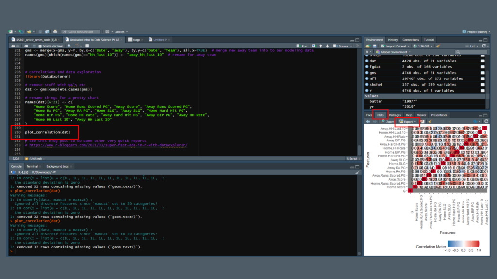
The plot’s a bit of a mess when you look at it in the window. Fortunately, you can export the plot as an image. Just make sure you uncheck the “maintain aspect ratio” box and size it how you’d like to view the image.
ITo manually size the image use the dimensions in the upper right. A size of 1500×900 pixels gives you a clean, readable image.
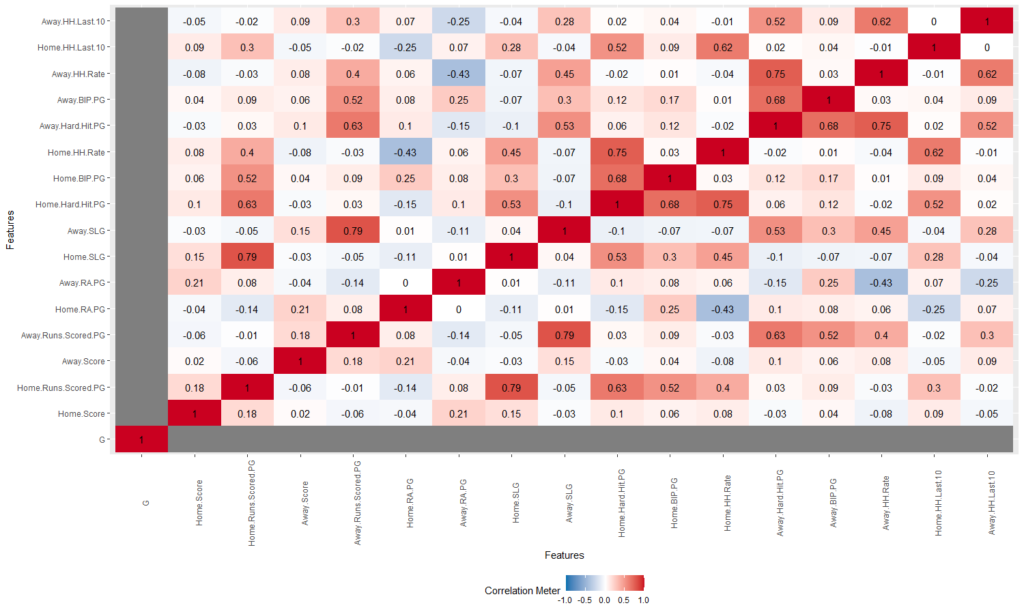
Here, the darker the red, the more positive correlation there is. The darker the blue, the more negative correlation. The more white means less or no correlation. It’s on the same -1 to 1 scale that we used in Excel, but here you have a clean image you can easily scan. You can see how slugging percentage and home runs per game move together, and how hard-hit rate impacts both.
This code is flexible – with a little editing you could create other features at the team level. You could also tweak it to work at the player level and hunt for correlations that work for props. Play around with it and let us know what you come up with.
Next Up
When we reconvene in two weeks or so, we’ll look at how to source betting information and add that to our data, as well as start asking more questions about our variables about how hard-hit rate can impact baseball games.
In the meantime, if you have any questions, reach out to us on Discord.
If you missed our previous installments, here’s where you can find those: